Last updated on 2023-09-21
Important Notice: This guide is protected by copyright, and any unauthorized distribution is strictly prohibited, with legal consequences for breaches.
This is a guide for typesetting - InDesign position test.
The guide is created based on the order of work. Please read it from the top and take the test accordingly.
00. Important Notes for Submission
•
Submission Format: idml (InDesign File Extension)
◦
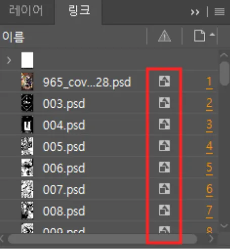
Make sure all files linked within the indd are properly linked and saved before submission.
◦
When saving, use the idml extension, not indd.
01. Folder and File Format
•
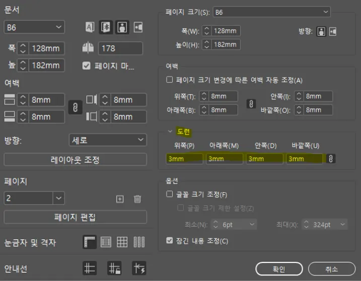
When creating an InDesign document, adhere to these specifications:
◦
Margins can vary from 0 to 20 mm.
•
Open the original file in InDesign and work on it.
•
When working with an original PSD file:
◦
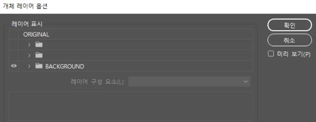
Check if it has separated layers.
◦
If yes, show only the background layer in the object layer options.
◦
If the original file is a TIF or a PSD with no separated layers, delete all the text that needs to be deleted before starting the work.
•
Be sure to include links for all files.
•
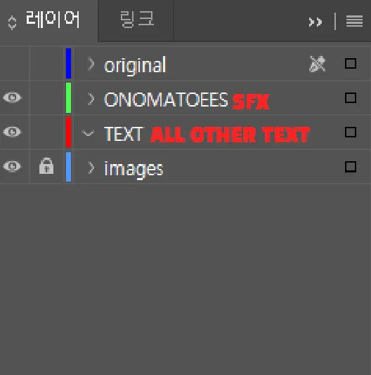
Organize the layers as follows:
◦
Keep all text layers active in InDesign.
◦
Create a separate original file with all layers active for inspection(typesetting check) (deliver after turning off visibility).
02. Speech Bubbles & Typesetting
•
Ensure all text sizes are integers.
•
Use original speech bubbles -that are merged with the original layer - without modifications:
◦
Do not delete or redraw speech bubbles.
•
Follow font settings in the Font Design Note:
◦
Use the specified font size.
◦
If the original font is larger, maintain the proportion.
•
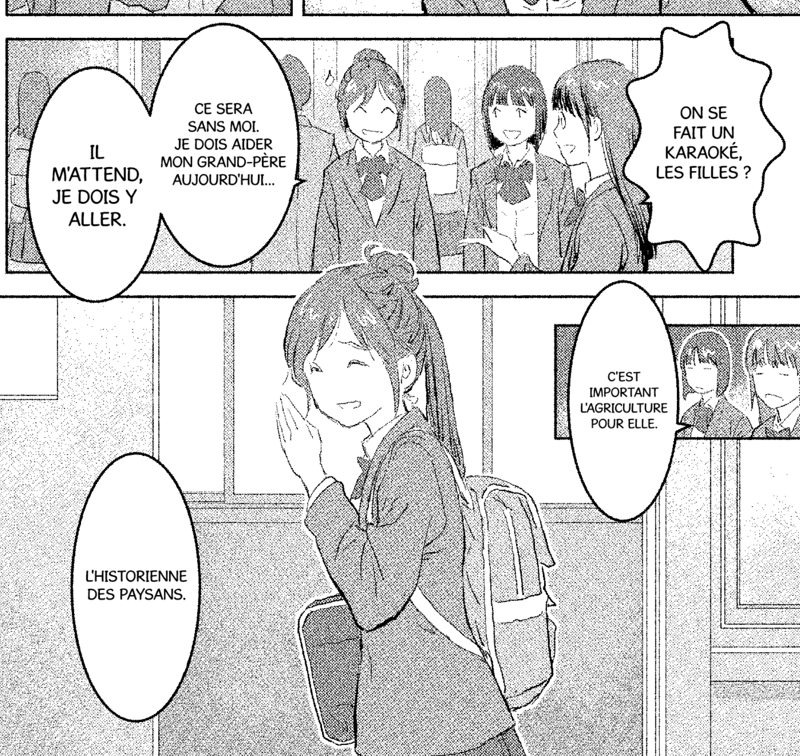
If translated text doesn't fit, reduce font size so it fits in speech bubble.
◦
Aim for consistent spacing within the speech bubble.
◦
Since the Align feature is not available, ensure the text is centered.
◦
Avoid text and speech bubble overlap.
◦
No strict minimum font size, but prioritize readability.
▪
Must be legible on smartphones.
▪
Fit inside the speech bubble without touching the border.
•
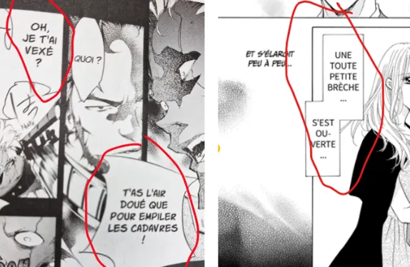
If a word is too long to fit inside the speech bubble, you can use "-"
◦
When using a hyphen, please copy and use "-".
◦
◦
If you need a line break for a word with a hyphen, be sure to put the hyphen at the end of the sentence.
•
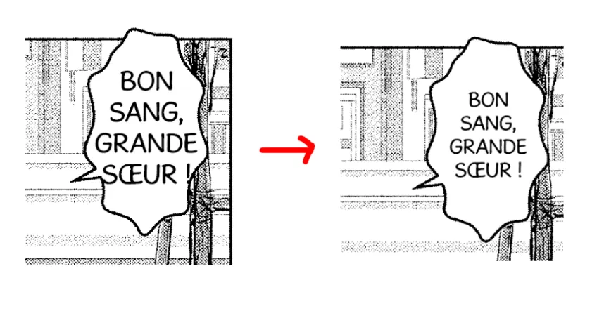
If you want to increase the font size, you can do so by placing punctuation marks (… / ? / ! / etc.) at the very last sentence (Please refer to the image below).
•
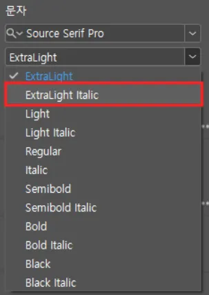
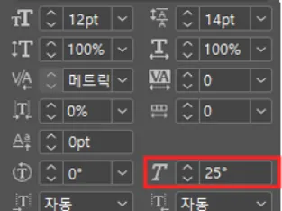
Apply formatting like italics or bold as in the original text.
•
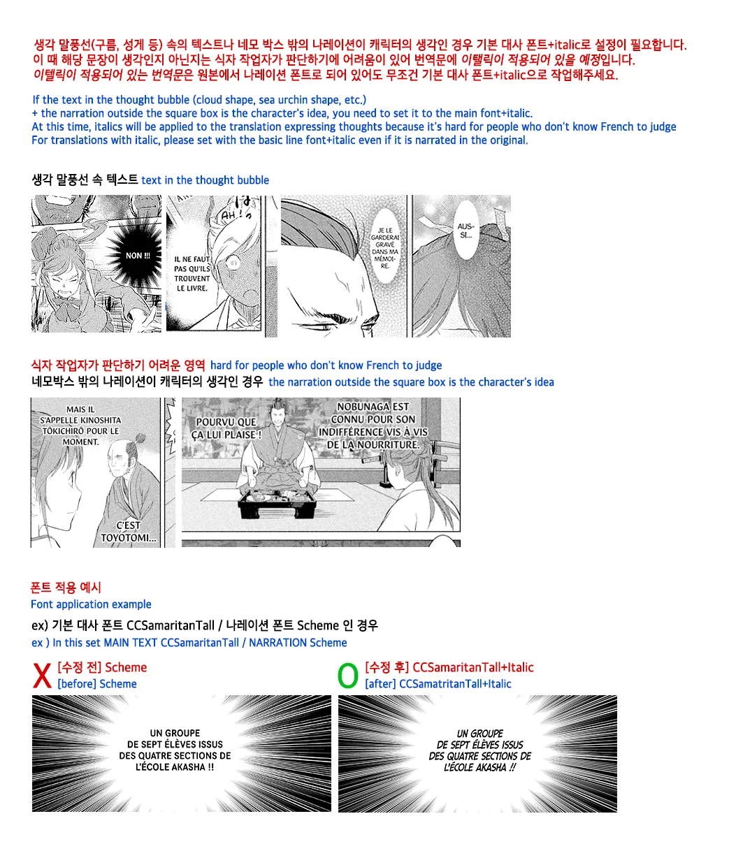
If the translated text is in italics, apply the default dialogue font along with italics settings.
◦
For text within a thought bubble (e.g., cloud, starfish shape) or narration in the background, consider whether they align more closely with the character's thoughts or soliloquy rather than standard narration. If they do, use the default dialogue font with italics.
◦
It's often challenging for the typesetter to make this determination, which is why such text is marked as italicized during the translation phase.
◦
Consequently, any translated text marked as italicized should be typeset using the default dialogue font with italics enabled.
•
If you receive a request for superscript, please apply the superscript feature in the character settings.
•
Please apply Bold/Italic effects using family fonts for all fonts.
◦
Please use the Bold/Italic application within the tool only when the family font does not have Bold/Italic.
◦
When doing this, consider readability for each font. Input the value in the 'thought font' section of the font setting book. (The same value must be applied across all episodes.)
03. Sound Effects
•
Work on sound effects while maintaining the sound effects merged into the original layer.
•
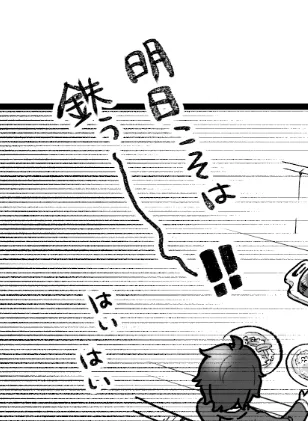
Position sound effects harmoniously without overlap.
•
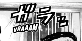
Enhance sound effects for visual readability.
◦
Consider sound effect meaning and direction.
◦
Preserve original sound effects like FX and texture.
◦
Use varying slopes, heights, and font sizes for depth and variety.
•
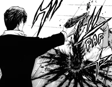
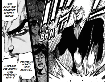
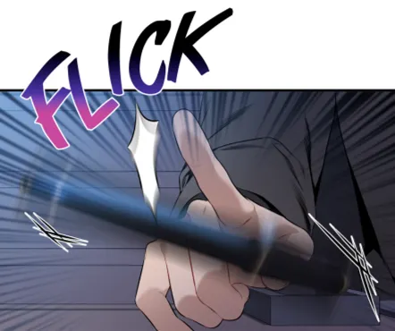
Example where the meaning of the sound effect is well expressed
04. Image Retouching
•
Delete everything except sound effects and some backgrounds.
•
All retouching must restore the original drawing or texture as it was.
•
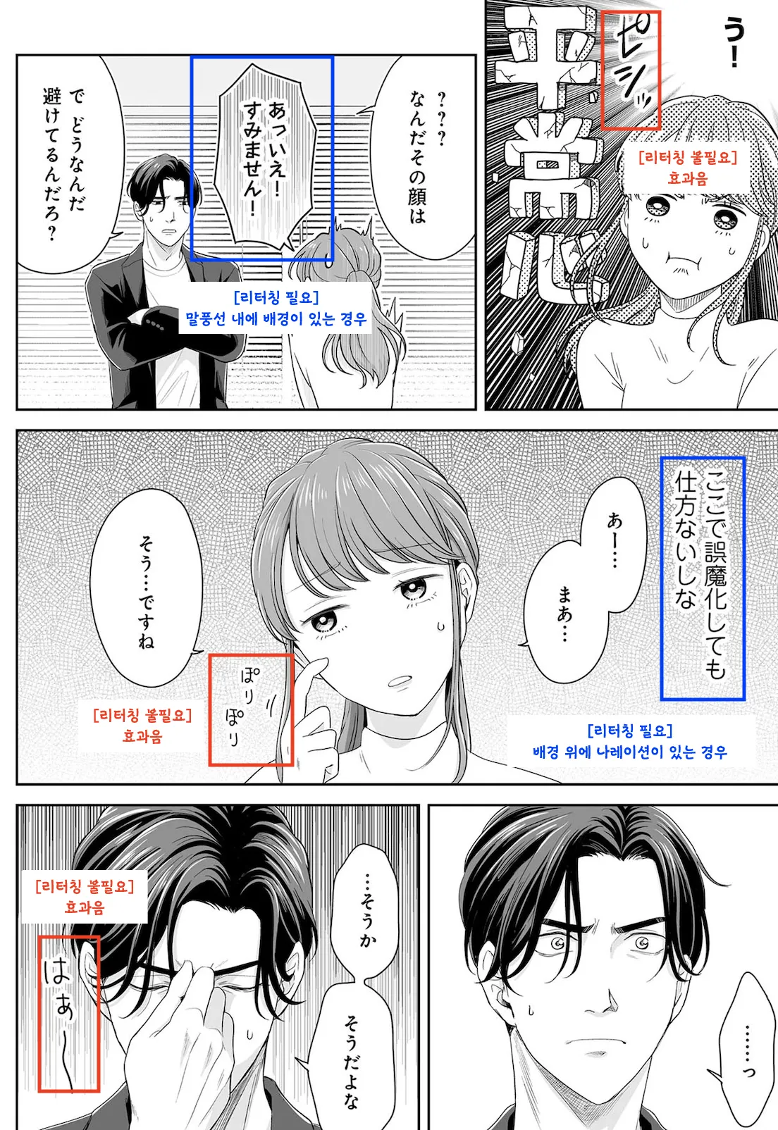
Retouching required:
◦
All speech bubbles with dialogue
◦
Narration in the background
◦
Text in the background (drawing) that affects the story
•
Please delete all speech in the background (BG speech) as much as possible.
•
Precautions when retouching
◦
Is the effect used the same as the original?
◦
Is the perspective appropriate?
◦
Is the position appropriate?
•
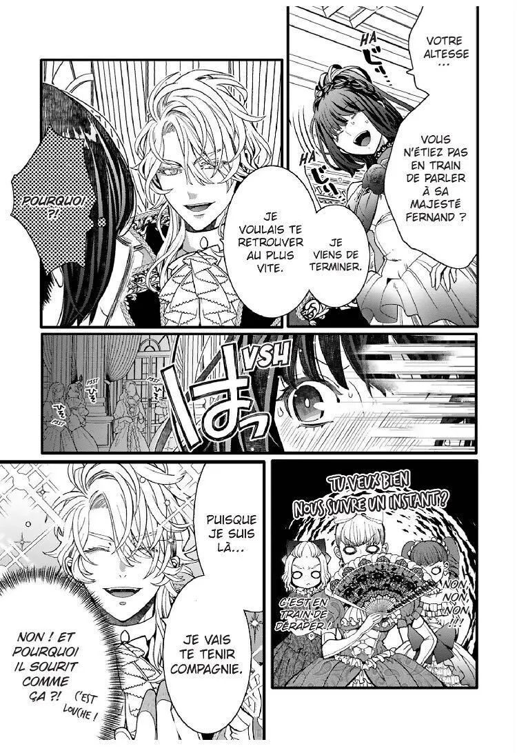
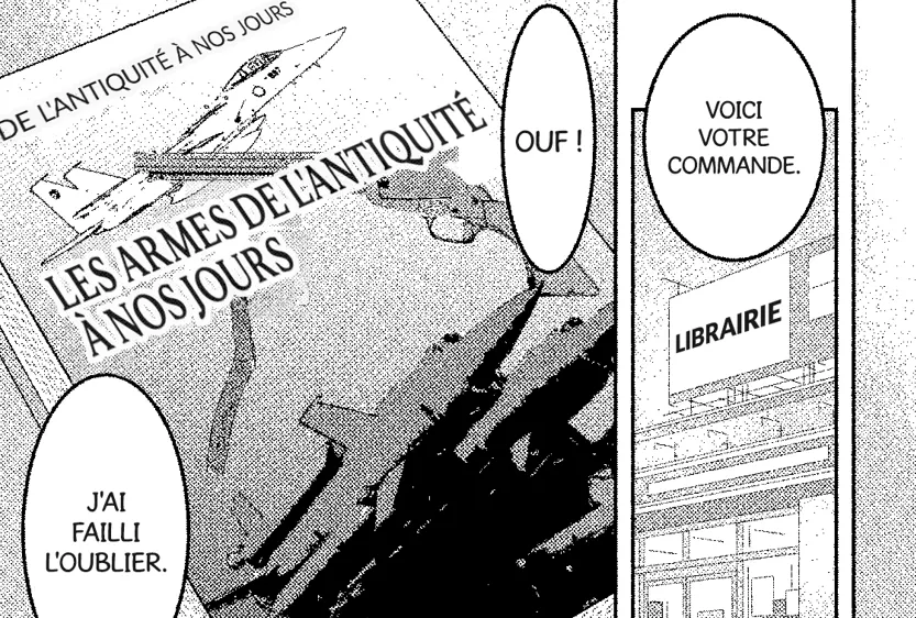
All text related to the story requires retouching.
◦
Delete the original Japanese.
◦
Add the French translation.
◦
Start retouching.
•
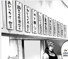
If the text in the background of the drawing is not necessary to understand the story, no additional work is needed.
◦
In the cases below, there are no translated texts.
•
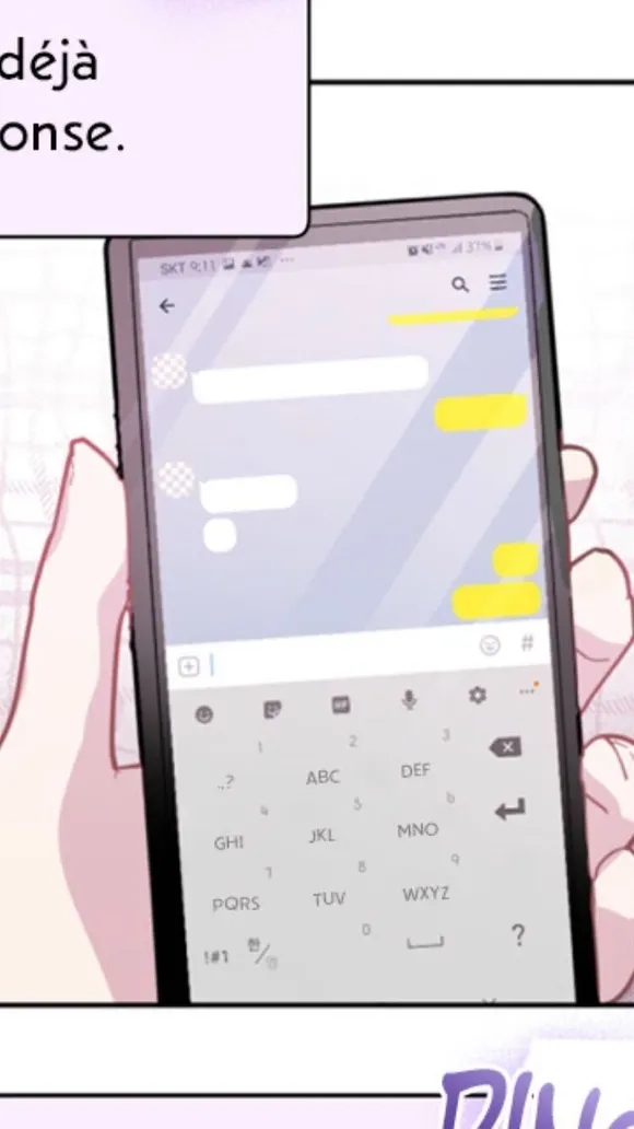
For cell phone keypads, retouch as shown below.
•
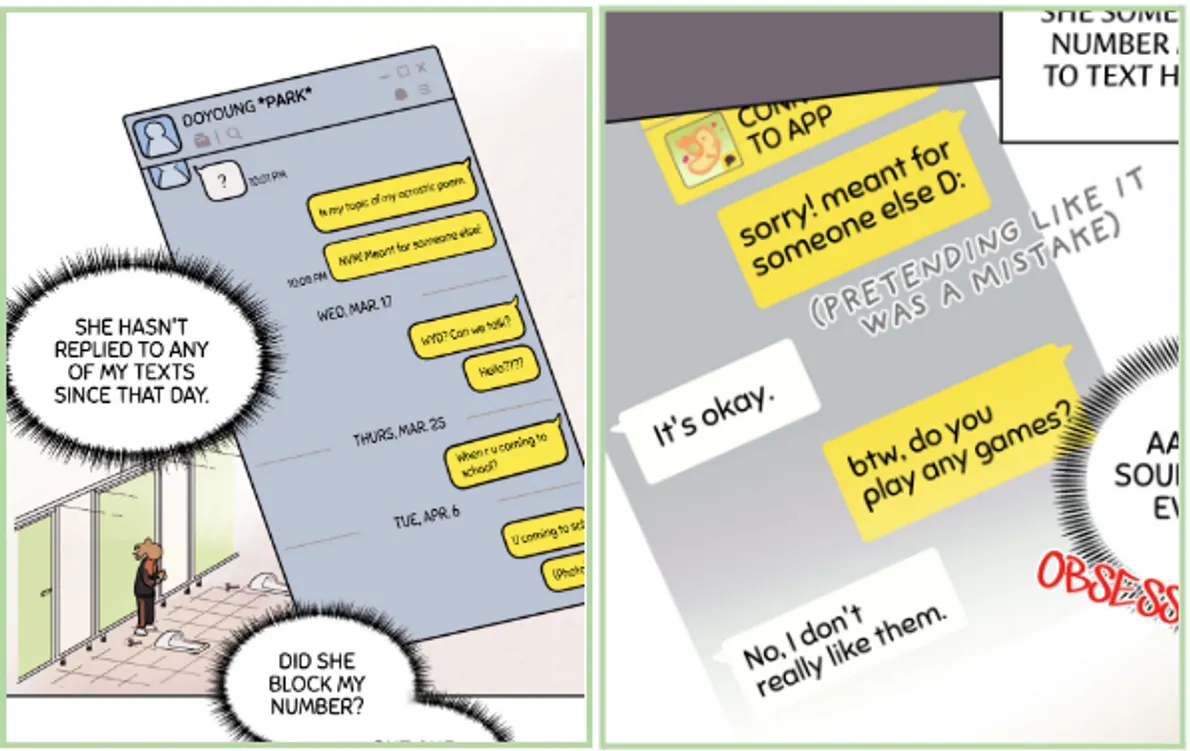
For screens like handwritten letters and messenger conversations, use case-sensitive letters by disabling the TT setting.
◦
Capitalize names.
◦
Maintain case-sensitivity for message content.
◦
Default alignment: Left.
◦
Adjust as needed based on size and reading direction.
05. Light Novel
•
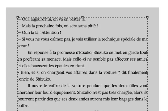
Definition : Bonus novel pages that appear in some volumes.
•
Requires a consistent margin on all sides.
◦
Ensure consistent margins across all light novel pages.
•
Utilize Adobe Garamond as the designated font for light novels.
•
Apply case-sensitivity to the light novel text by disabling the TT setting.
•
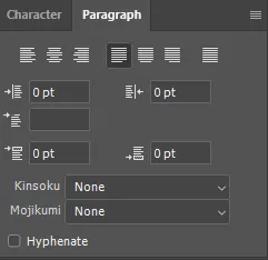
Configure the paragraph settings to "Justify Last Left."
