Last updated on : 2023-06-22
This is a guide for Voithru Kakao Piccoma - Japanese (JP).
This guide has been created based on the work order. Please follow it step by step. 
Index
[Getting Ready for Work]
Welcome to the Voithru Webtoon Typesetting Guidelines! Please read through the following guidelines carefully before starting your work.
01. How to Create a Font Design Note
Your first step is to create your own Font Design Note.
Here are some files you may find useful.
•
You can find the list of Japanese fonts you can use in the file above.
•
Please refer to the sample above to create your own Design Note.
[Requirements for a Font Design Note]
A sheet to compare the original image with the image with fonts applied
An example of a long roll format with all fonts applied (about 2-3 rolls)
A PSD file of an example made with roll images
[Steps in Creating a Font Design Note]
1.
Download the [JA_Font List] and the [Sample_Font Design Note] provided above.
2.
Open the original file provided for typesetting work and check through the entire file to make sure no font type is left out.
*Please thoroughly check the entire files provided, not just the first few files.
3.
Arrange the dialogue/narration/sound effect/background speech first.
4.
Understand the features of the fonts, including font style, serifs/sans serifs, size, font thickness, angularness, handwriting look, and text weight, and identify fonts that are similar to the ones in the original image.
•
Font style
•
Serifs/Sans Serifs
•
Size
•
Font thickness
•
Angularness
•
Handwriting look
•
Text weight
5.
Select the text from the [JA_Font List] that closely resembles the one in the original image.
** If you believe you need to add a new font that is not listed in the list, please reach out to QM (Quality Manager), Hae-bin Kang for approval on Slack.
6.
After adjusting the text settings, create a Font Design Note with the following details:
•
Include the font name, size, letter spacing, and a comparison with the original image.
•
Please note that the size of sound effects may vary, so you may indicate "size change due to the original" in the Font Design Note as shown below.
•
If possible, maintain Auto Letter Spacing.
•
Here’s an example of a long roll format with all the applied fonts (approximately 2-3 rolls)
02. Font Settings
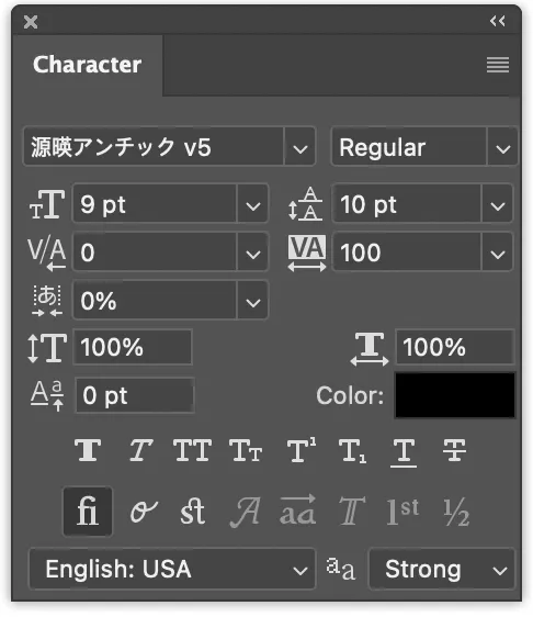
[Text Settings]
•
Since Japanese is written vertically, the settings need to be adjusted accordingly.
•
Navigate to Windows → Character → Upper right icon ㈢→ Change Text Orientation.
The highlighted section in red must be fixed in the font settings.
[Paragraph Style Settings]
•
Go to Window → Paragraph Styles → Add Paragraph (+) → Double-click on the added paragraph → Justification
•
Adjust the value according to the red-marked sections as shown below.
[Paragraph Settings]
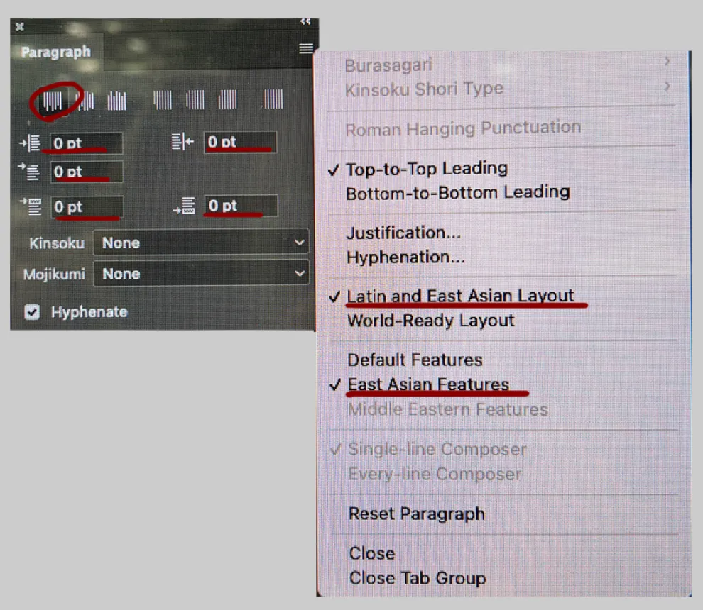
•
Go to Windows → Paragraph → Click the [top left alignment] icon → Click on the upper right icon ㈢ → Click Latin and East Asian Layout → Click East Asian Features.
•
Modify the values indicated by the red marks in the image below.
03. Resolution/Image Size
•
Typesettors must not alter the resolution and size of the original image.
The final delivery should be in PSD format only.
◦
If there is a need for inter-frame space due to narrow spacing between dialogues, vertical pixel adjustment is allowed.
[QA Delivery Format]
•
PSD
•
JPG (Roll format with the same size)
•
JPG (720 or 760 * 1000px) / Thumbnail 100*80px → zip file : Use Webtoon Cutter Tool
•
Thumbnail: 100 (width) * 80 (height)px
[Logo Production]
01. How to Create a Logo
1.
Check the original file.
2.
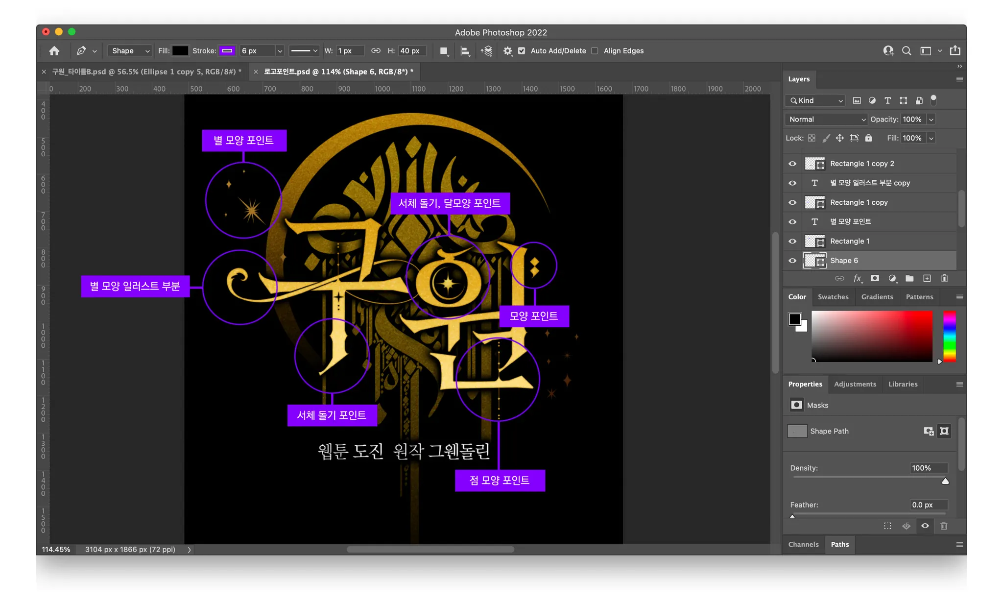
Examine the focal points of the logo. (purple circles)
3.
Identify the effects applied to the logo.
[Effects to be identified]
•
Gradient effect
•
Stroke effect
•
Texture effect
•
Outer glow effect
4.
Check the font list to find a suitable font and make a comparison for selection.
•
If the provided font list does not have a suitable effect, contact QM Hae-bin Kang on Slack.
5.
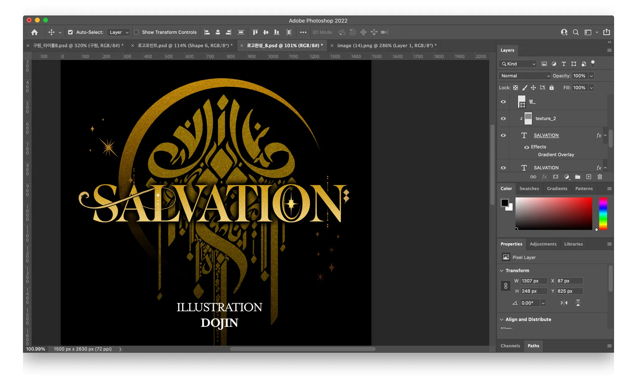
Apply effects such as gradient, stroke, and outer glow.
•
Adjust direction, color, etc.
6.
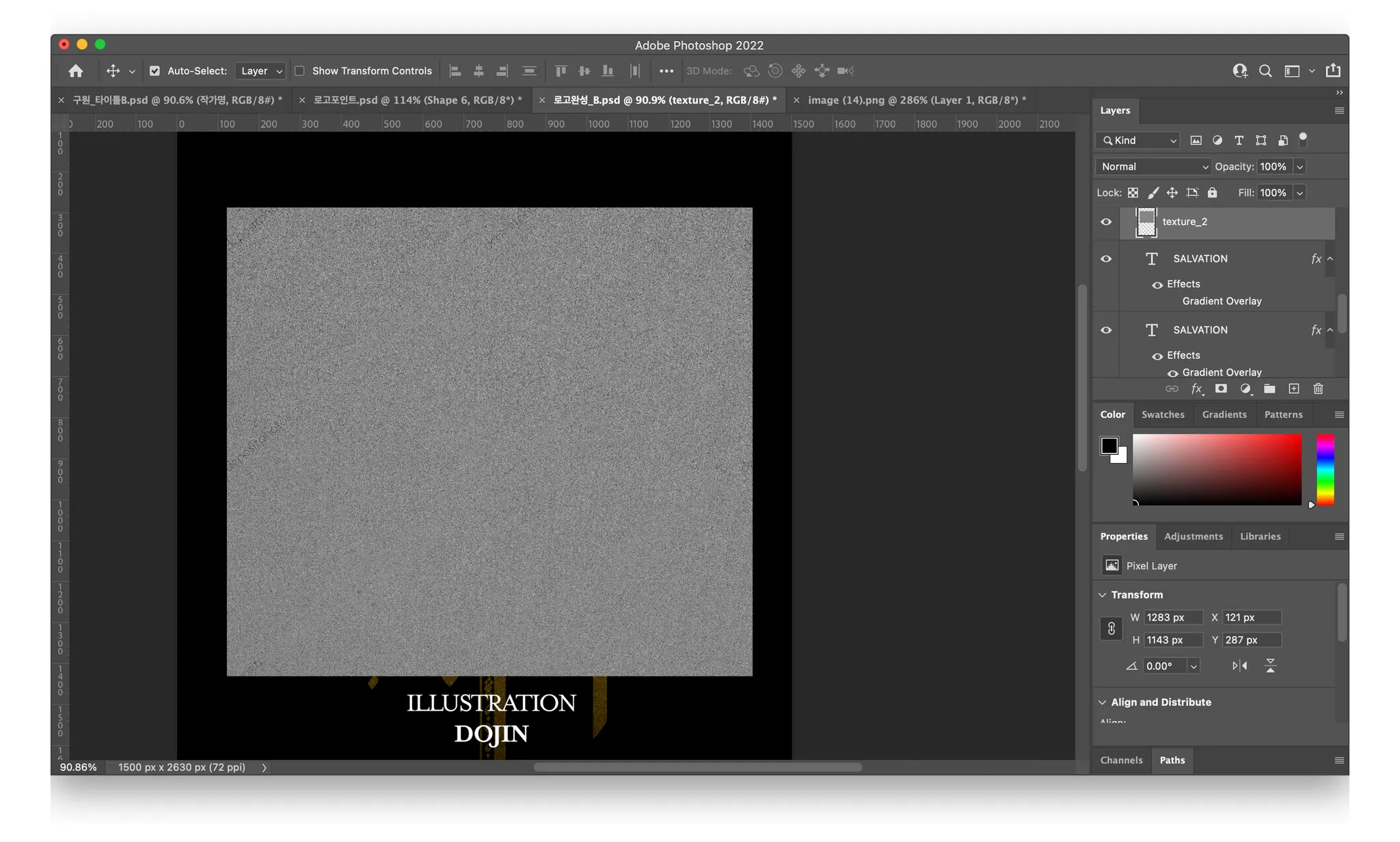
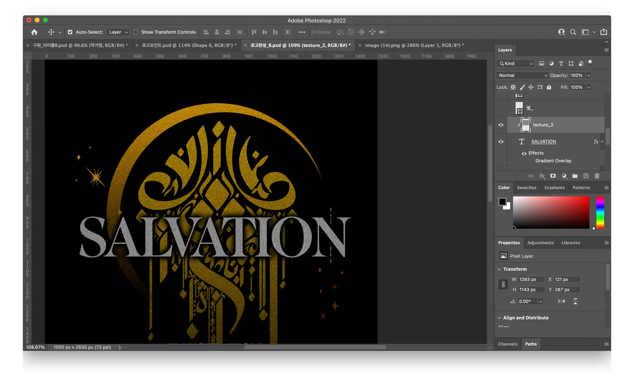
If there is a texture, find an appropriate one and clip it.
•
Duplicate the text layer (Control + J) → Remove the gradient effect
•
Place the texture layer on top of the copied text layer
•
Select the texture layer → Right-click → Create Clipping Mask
7.
Adjust the Normal value of the copied text layer to find the appropriate one.
8.
Extract the focal points of the original and separate them into layers.
•
Select area → Select the corresponding layer → Copy the layer (Control + J)
9.
Place them in appropriate positions to complete a logo that has a similar feel to the original.
[Typesetting]
01. Folder and File Format
•
Create a parent folder for the project with the episode number as the folder name.
•
Within the parent folder, create a subfolder for PSD files → Tyesettors need to submit only PSD files
•
001(Episode Number)_(English Title)_File Number
•
Example: 002_Herosmama_001 / 002_Herosmama_002 / 002_Herosmama_003 …
•
If the original file is in PSB format, convert it to PSD.
- If the file size is large or the canvas size is more than 30,000px in height, it will be automatically saved as a PSB file. In this case, you need to adjust the canvas size and convert it to a PSD file before proceeding with your work.
[How to Convert PSB to PSD]
Watch the video tutorial on how to convert PSB to PSD
1.
Click on View → Rulers in the top bar [Shortcut: Control + R]
2.
Drag the ruler to the area where the image and text are not cut off.
3.
Use the crop tool to cut only the top part up to the area marked by the ruler.
4.
Save the file under a different name and adjust the file number accordingly.
5.
Use the Undo function (Control + Z).
6.
Cut only the bottom part up to the area marked by the ruler.
7.
Save the file under a different name and adjust the file number accordingly.
02. Creating the Original Layer
1.
Creating the Original Layer
•
Select the entire layer → Copy the layer (Control + J) and paste it (Control + V).
•
After selecting all the copied layers, merge them by pressing Control + E or right-clicking and selecting “Merge Layers”.
•
Change the name of the merged layer to [Original].
•
Move to the top layer using Control + Shift + ]
•
Toggle the visibility of the layer (eye icon) on and off while comparing it with the original to work.
03. Layer Organization
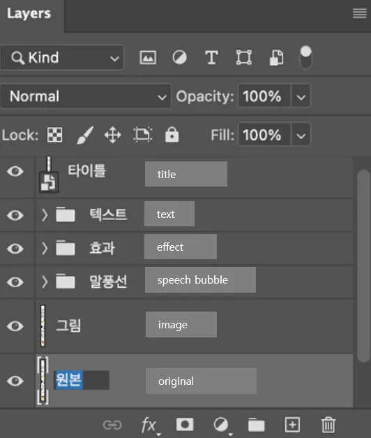
Organize the layers in the following order and put items in the corresponding folders.
04. Dialogue Input
•
For basic dialogue / narration, follow the settings in the Font Design Note.
•
However, if there are changes in the size, bold, italic, etc. of the original dialogue, adjust the settings to match the original.
•
When changing the font size, please use whole numbers (e.g., 18pt) instead of decimal points (e.g., 18.32pt).
05. Creating Speech Bubbles
[Notes on Creating Japanese Speech Bubbles]
•
Speech bubbles must always be created using the shape tool and the pen tool, in a path state
•
For sea urchin speech bubbles or speech bubbles with illustrations, use the original file.
•
Since Japanese is a vertical language, the speech bubbles should be created in a vertical shape, not horizontal.
[Creating Speech Bubbles]
1.
Use the shape tool to create the desired speech bubble shape.
2.
Refine the shape using the path bar.
•
Press the A key to activate the selection tool (anchor) to adjust the path.
•
Hold the shift key and move it vertically and horizontally to evenly refine the shape of the four corners.
3.
Input text.
4.
Align the text to the center using the Align option located at the top.
5.
Adjust the margins on all sides.
•
Consistency is crucial, so please maintain a consistent spacing of approximately the width of one character on all sides.
•
Ensure that the text and speech bubble shapes align properly to maintain consistent spacing.
•
Be cautious not to compress the spacing when the text is long or stretch it when the text is short.
6.
Double-check the center alignment with the Align option at the top before creating the speech bubble tail.
•
Please ensure proper center alignment before creating the speech bubble tail.
7.
Click on the speech bubble and use the pen tool to create the tail.
8.
Select both the newly created tail layer and the speech bubble layer, then press Control+E to merge them (Shape Merge).
•
Alternatively, use the Combine Shapes option at the top and create the tail with the pen tool.
For individuals facing difficulties with the shape, size, and spacing of speech bubbles, please refer to the provided example and file below!
06. Speech Bubble Placement
•
Japanese is arranged from right to left.
•
Please make sure the speech bubble tail is facing the speaker's mouth.
•
Please avoid covering important images with the speech bubbles, such as the character's face or important effects.
•
Please place speech bubbles on a clean, uncluttered background, while ensuring they are positioned near the margins of the image to maintain visual coherence and flow.
•
If the speech bubbles has to be outside the cut line, please do not place the speech bubbles too close to the cut line or too far out of the cut line. It is best to have 1/3 of the bubble inside the cut line or 2/3 inside the cut line.
•
Please move the speech bubbles to the margin (outside the cut line) if they cover too much of the image or fill too much of the cut.
•
Please make sure speech bubbles do not get cut off on the sides.
•
Please place speech bubbles on the sides with a slight space in between them, not too close to the side.
•
If there is no space left, please move the original background slightly to create some space (when doing so, please move all layers inside the cut to the same space).
07. SFX Production Method
•
SFX has many layers with detailed effects, like effect lines, so please do not delete layers and be careful not to turn off the eye icon.
•
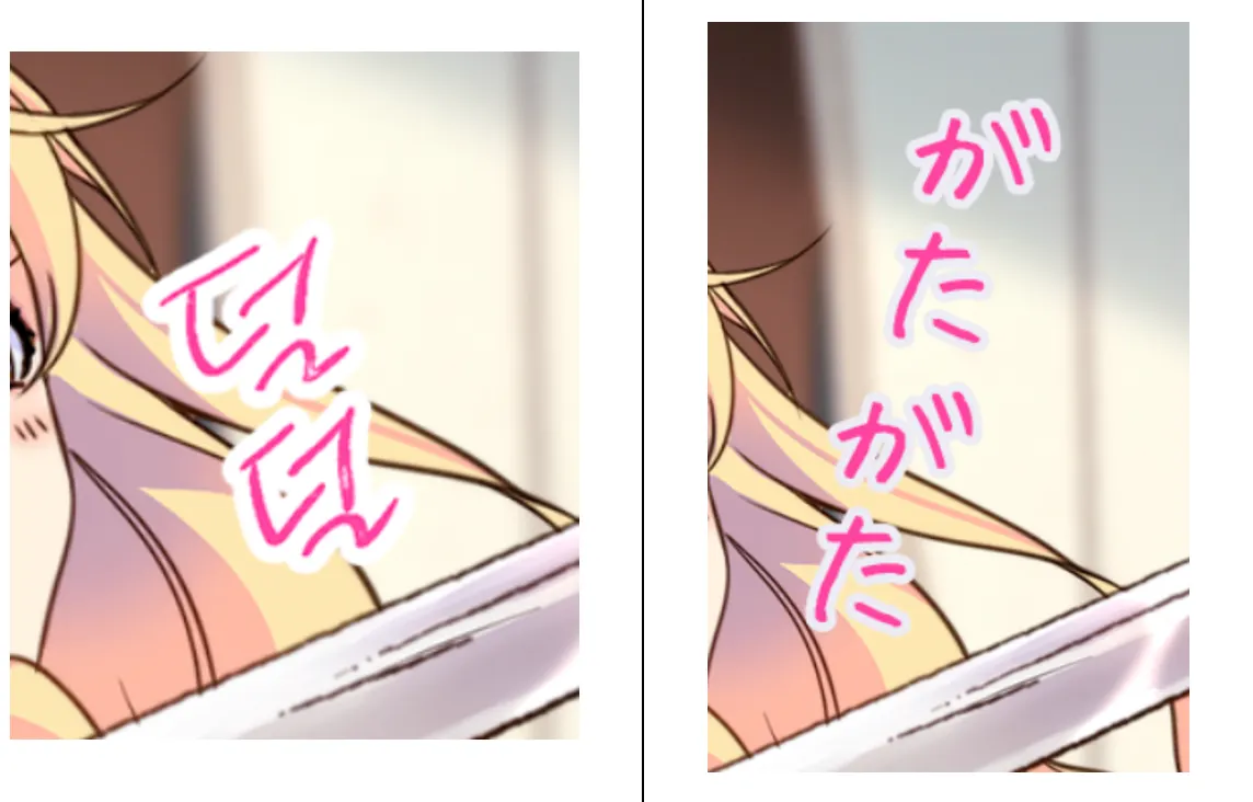
SFX must be made in a vertically long shape.
•
Please do not divide the same word into different layers.
As shown in the picture below, adjusting the values of the Character setting makes it possible to represent the SFX with only one layer.
•
Please be careful not to set the character spacing too far apart by adjusting the letter spacing.
•
Please apply the same effects as the original for the SFX (e.g., gradient, stroke, texture).
•
Please adjust the size, intensity, and tilt of the SFX.
•
If any text modification is required, please convert it to a smart object for easy editing.
Right-click on the SFX layer that needs modification → Convert to Smart Object → Apply the effect.
08. SFX Placement
•
Avoid excessive cascading layered placements to prevent wide letter spacing.
•
Place SFX near the margin without covering important scenes.
•
Keep SFX at a distance from the cut line. If it exceeds the cut line, remove 1/3 or keep 2/3 inside.
•
Arrange SFX from right to left and top to bottom, especially in diagonal arrangements.
09. BG Speech
•
Maintain a left-to-right arrangement while referencing the original location.
•
Position BG speech in the margin for readability without covering the original image.
10. Korean String (Untranslated Texts)
•
If you encounter untranslated texts during typesetting, notify the PM and QM in charge on Slack.
•
For cases requiring translation, retouch the text before inputting the translated version.
•
For the Korean strings that are so tiny that it does not seem to require translation, notify the PM and QM in charge on Slack first to decide to blur or brush the Korean strings.
[Q&A]
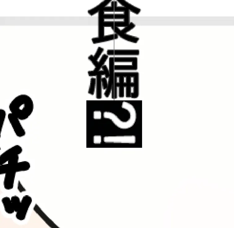
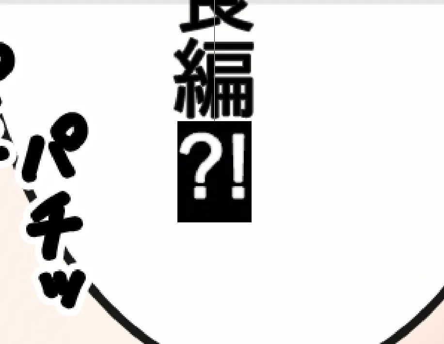
01. “?! and Numbers are Horizontally Displayed”
1.
Drag ?!
2.
Click on the green-marked icon in the upper right corner.
3.
Press Tate-chu-yoko to activate.
02. “How do I input Ruby?”
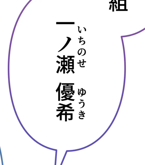
•
Ruby represents the pronunciation of Japanese kanji written in hiragana or katakana next to the word.
1.
Enter the corresponding hiragana or katakana for Ruby in a single text layer.
2.
Only reduce the size of the hiragana or katakana for Ruby and adjust the line spacing accordingly.
3.
You can modify the letter and line spacing to adjust the spacing accordingly.
•
It's important to note that letter and line spacing vary based on the lengths of ruby and kanji. To achieve precise adjustments, it is necessary to utilize the character setting tool for each instance.
Remember:
•
Ruby is typically smaller than kanji.
•
Include the hiragana or katakana corresponding to the kanji within Ruby.
•
If the ruby characters are longer than the kanji, you can make Ruby even smaller.
[Before Submit]
01. Checklist
Have all original PSB files been converted to PSD?
Is the delivery specification appropriate?
Are there no remaining Korean characters in the original?
Does the layer organization follow the guidelines?
Is the font set according to the Font Design Note?
Are the character settings, paragraph style settings, and paragraph settings in line with this guideline?
Are all speech bubbles created as paths?
Are sound effects created as smart objects?
Are the file names correct?
02. Delivery Specification
This section provides guidelines for the file and folder naming format to be used when submitting your work on the totus editor after completing the typesetting process.
•
Initial Work: ep.1 - 20
◦
Folder Name: First Delivery (Submit only the PSD files)
◦
File Name: (001, 002, 003, ...)
•
Episodes After the Initial Work
◦
Folder Name: PSD (Submit edited PSD only)
◦
File Name: (Episode No.)_(English Title)_(File Order e.g., 001_001, 002, 003… )
Example:
021_Kidnapped_001.psd
021_Kidnapped_002.psd
021_Kidnapped_003.psd
◦
Folder Name: JPG (Submit JPG with the same size as PSD)
◦
File Name: (Episode No.)_(English Title)_(File Order e.g., 001_001, 002, 003… )
Example:
021_Kidnapped_001.jpg
021_Kidnapped_002.jpg
021_Kidnapped_003.jpg
◦
Folder Name: Sliced (Slice in units of (720 * 1000))
◦
File Name: (Episode No.)_(English Title)_(File Order e.g., 001_001, 002, 003… )
+ Thumbnail: (100 * 80) / File Name: thumb_h
→ Place sliced files and thumbnails in one folder and compress
→ Rename as 001_第1話 (EpisodeIn3Digits_第EpisodeIn1Digit話) for file name.
Example:
007_第7話
Example:
•
Submit them on totus editor


